What Contacts To Wear This Season

Contacts to wear for each season

As this entire year of 2020 has been full of surprises, winter must be celebrated at its best too. While the month of November brings the winter season, the December month is the time for the celebration of all the magical events of the year.

This winter season brings various occasions for upgrading your look book game and becoming the fashion icon that you always wanted to be. The fresh and unique contact design will make you become the talk of the town. For becoming the showstopper at your town hall party, you must try these unique and creative contact lenses and figure out what suits you the best.

Here is the list of designs of contact lenses for various events in the year 2020 that can make your outfit game stronger and unique. 

Red Coloured Contact Lenses

As the winter season is most famous for its magical and auspicious event of the year, and that is Christmas. For your Christmas event party, you can design a shimmery and sparkly outfit for yourself, which must include the bright red colour for sure. The red colour for the Christmas party can make your outfit right as per the event. The makeup can be subtle and natural but with bright red lipstick. At last, you must not forget to finish your outfit with red-coloured contact lenses that will give you the right Christmas feels. With a red-coloured Santa hat, you can make the impression of being the coolest Christmas pal this year.

Brown Coloured Lenses

This season, the occasion of thanksgiving is going to be more grateful and filled with grace. 

As we have faced numerous unpleasant events this year, your outfit for thanksgiving must be a little more bright and extravagant. Spice up your outfit with some hypnotising deep brown contact lenses to lift your look to the next level this season.

You can play with various colours such as blue, olive green, yellow, or black. The colours must be bright and must give optimistic vibes around you. To set a happy aura, you can dress up with light but beautiful colours such as pink, orange, or white as well. 

However, whatever colour you wear, don’t forget to finish your outfit with brown-coloured lenses that will make your eyes magical and dreamy. 

Black and White Contact Lenses

This year you must try the most unique and creative designs. As this year has been a year of strange events, you must make your outfits extravagant and a little up the notch. Design your outfits with the more creative colour schemes such as colour blocking, stripes with stripes, and more. At last, finish your outfit with the fresh and creative design of black and white strip contact lenses that will make your outfit as well as your Halloween party extraordinary and fun.

Green Coloured Contact Lenses

This New Year’s eve, design your outfit in the most unique and crazy style. Be the talk of the town or take the spotlight at any party with unique coloured contact lenses. 

While the year 2020 is ending, make it a blast and wave 2020 goodbye with green coloured contact lenses for a fresh look for a fresh new year.

Green coloured contact lenses can make the colour of your eyes pop, and with a smoky eye look, you can make your look vibrant and flamboyant. 

Be the trendsetter in your town with the most pretty and odd-coloured contact lenses and get the best dress award. 

Five of the safest toy brands for your baby

Baby playing

Many classifications, several items – welcome to the wide universe of rigging! Picking what’s directly for you and your infant can be a difficult job. Start by looking at the best: advancements in toys, modern toys have attracted the attention of many people. It is not just the great appearance, looks, colour, shapes of toys make them popular – the new toys now come with some additional features which make it fun for children. The toys are also sometimes educational.

As we all know babies are very sensitive, Physical contact is a baby’s first emotional bond, touch is key for emotional and intellectual development. Skin is the first line of defence against toxins, irritants, and allergens. Babies’ skin is up to 30% thinner and more sensitive than adults. Babies’ eyes are in process of development after their birth also so it is important to take care of them and find something which is easy on their skin.

Babies can smell before they’re born. As a proud mom of a beautiful baby, the stage you are most looking forward to is witnessing her play with her cuddle able toys. While the first few weeks after birth babies do not need toys as, they are still adapting themselves, once the first month is over, new-born will start enjoying playing with her toys. By holding and touching them. Playing with toys helps babies to develop skills and start their learning off at a young age. Encouragement is the best thing for the development of the little one.

Teddy bear

All you need to ensure is that what you buy is age-specific and safe for your angel.

  • Funskool: The Funskool brand is among the top brands that manufacturers infant toys and baby products. Funskool products are best for new-borns as well best for infant toys some of the toys are baby rattles, gyms, infant play gyms, imaginative toys, dolls and dollhouses, toys, bath toys, pull along toys, stacking toys as well as tethers’, educational toys, musical toys, blocks and soothers.
  • Disney: Disney doesn’t need introductions, but it is one of the much-loved baby toy brands that are available around the globe. For the babies and the newborns, there are various toys that come in the form of teethers, rattles, character figurines and even soft toys.
  • Tollyjoy: This is a brand that stands for gifting to the baby you love and the company aims at making toys as safer and reliable as they can be. This takes the whole baby gift shop experience to the next level. The toys that belong to the brand Tollyjoy adhere to the stringent rules in place concerning hygiene and safety.
  • Chicco: Chicco, one of the biggest baby toy brands and has been the concept of achievement for over 50 years now. The several toys that you can buy from Chicco for your children are their first sound toys, walkers, toys rattles, night lights and pull along toys.Making the right choice is equally important as it won’t just help the child to play but also helps in learning new skills. Now you have some great choices of trusted and well-known baby toys that you can have a look at and buy as a gift for someone’s baby or for your own. This gives you plenty more options than buying baby clothes online. Enjoy watching your baby play with safe and trusted toys from the brands that we know. And as a mom, you can be absolutely stress-free and enjoy a cup of tea without any concerns.

Sydney’s Top 5 Residential Interior Design and Decor Ideas

Sydney’s Top 5 Residential Interior Design and Decor Ideas

Have you just moved home or are you looking at updating your existing home a little? There are some popular interior design and decor tricks that interior designers in Sydney use and you can use them as well with minimal cost and effort involved. Did you know most times it is the smallest things that have the most significant impact? It could be from just adding a lamp or plant to mirrors on the wall or some fresh artwork.

Perhaps you want to brighten a room, soften the walls or bring some warmth to the living room. With the housing marketing booming and increasing demand for property in Sydney, many smaller apartments are being built and cramped in to satisfy the need for housing. Here are some top interior tips that will inspire you and change the way you design and decorate to make the most out of your space.


Paint small rooms in soft, lighter colours


The living room is an excellent example of just how you can maximise a small area. Living areas tend to be cramped but can be made more pleasant through soft coloured walls. Mirrors reflect light walls and light coming in from windows and doorways and give the illusion of a more spacious area. Using dark colours will make a room appear small or cramped. Dark places will have a boxed-in feel to them which you want to avoid at all costs.


Add mirrors for more light 


Mirrors can be used to make a small room appear bigger. If you place a mirror right across from the window, it will add more light to the space. Decorative mirrors can be used instead of art if you want to fill in ample wall space. Whether they are small or big, the mirrors will add dimension to the room.


Mix up textures and patterns


There is nothing wrong with adding some heirlooms right next to your modern sofa. Your house design should show your personality and who you are. Your family heirlooms tell a story, and there is no reason why the past and the present cannot work together. The same goes for artwork. You might not want to put a painting by Monet next to Salvador Dali, but there is no reason why they cannot be placed in the same room together. When talking fabrics on furniture such as throws and pillows, varied patterns and colours can bring in texture and warmth.


Use slipcovers


Slipcovers have been known to get a bad rep, but they are great things. They will serve as a way to change the look of your furniture and to reflect the current season. They are easily removable when you want to, and keep your furniture safe from dirty hands and food and drink spills on your furniture. They can slip off easily to be washed and adding a white slipcover to your couch will give it the look of elegance and sophistication, yet maintain comfort.


Using wicker baskets


Wicker baskets are gaining popularity and are a relaxed, yet elegant way to add storage to your home. You can use them in places like your pantry to store food or in your laundry to store bits and bobs like soap powders, brushes, pegs and more. They are great for storing books and toys to help keep the toy area clean and organised, and they work well in an office for storing paperclips, pens and notepads. Wicker baskets are a practical way to organise and minimise clutter.


The Best Hospitality Designs In Sydney?

The Best Hospitality Designs In Sydney?

Australia has many beautiful places, and there’s no doubt in that fact. However, the hospitality sector including hotels, cafes, restaurants, and hotels make full use of these places. Take for instance this luxury accommodation in Tasmania, which designs its interior and hotel packages around the natural environment it is surrounded in. Cafes and restaurants are not simply outlets for refreshments. Most of these hospitality places are decorated with attractive designs and creative concept. They have been put together by interior designers, architects, and project managers. We shall look at bespoke hospitality designs for a place in Sydney. 

Why Hospitality Designs Important?

The perception of any business is stronger if entrepreneurs create unique brands of hospitality designs. So, the hospitality interior should be unique with eye-catching visual elements. Most people can’t eat or drink without appreciating the beauty of the interior space. A serene cafe, a restaurant or bar with custom furniture and minimalist design can evoke a pleasant emotion in customers. Just take a look at how well-designed this fine dining restaurant in Hobart and how highly-rated this place is. There has to be a correlation between the two. Also, the use of well crafted interior designs in hospitality venues adds value to the business.

Interior design in hospitality centres primarily on service businesses including hotels, restaurants, cafés, bars, fitness clubs, lounges, spas, and state clubs, amongst others. The scope of work, budgets, and space preparation can be quite complicated, so designers working in hospitality require quite a bit of responsibility and has to be quite thoughtful with their design decisions.

Hospitality is one of the biggest industries on the planet…and it is also among the most important branches of the commercial layout. There are numerous luxury hotels across Australia from Hobart to Perth. In today’s post, I explore the booming hospitality sector and show why interior design plays a central role in service-driven companies.

Hospitality or commercial designers need to elevate spaces with a specific style and disposition in mind while also maximizing a space’s performance for financial gain. If it comes to lodging interiors, business comes first! Commercial interior designers in the hospitality fieldwork in tandem with architects, contractors, and manufacturers to guarantee all physical structures and architectural factors are aligned with the client’s vision and business requirements.

Fusing luxury with performance

Hotels, spas, and other support ventures have a number of the most beautiful and lavish interiors. A seasoned hospitality contractor knows how to strike the balance between luxury and top-notch functionality to make spaces which both business owners and customers will love. This is incredibly important for businesses seeking to make a fantastic first and lasting impression like in hotel inside design where this balance plays a significant part in the consumer experience.

Whether it’s a romantic lounge in the middle of Melbourne CBD or some sophisticated dinner place in Hobart, then each hospitality business needs a design to accommodate a specific a number of patrons whether it wants to optimise earnings. But, service-driven companies must also incorporate certain features and amenities if they’re going to excite and inspire clients.

A hospitality designer is also responsible for helping company owners with:

  • Lighting
  • Window Placement
  • Floor and Ceiling Design
  • Smart Technology
  • All Other Architectural Details.

They then need to create an aesthetic that meets the needs of the business through fabrics, art, colour schemes, furniture, window and wall treatments, high-end finishes, and accessories, and must also make sure each room is secure and up to code.

The Best Hospitality Designs In Sydney?

Some of the Best Hospitality Designs 

You might not like to make unnecessary interior design mistakes if you are a hospitality operator. So, using minimalistic designs for interior spaces is ideal for most hospitality venue owners. One of the best, high-end romantic getaways in Tasmania, for example, is a good example of a space that uses minimalistic design. Before hiring the right designers, ask them for references to their previous jobs, and check their online portfolio. Usually, clients ask their design contractors for proposals to evaluate their see completed projects. It’s only a functional café or restaurant design that complements your business vision.

Visit the Barangaroo House with Cantilevered Balconies

One of Sydney’s breath-taking waterfront destinations with multiple balconies is the Barangaroo House. Generally, this 3-tier balcony structure has ample spaces for cocktails, meals, and snacks. At the Barangaroo House, you can enjoy a range of Australian cuisine and wine. The three-layered edifice has rooftop bars with decorative elements like flowers, and it’s beside a skyscraper. This creative concept was initiated by the Rogers Stirk Harbour and designed by the Collins and Turner studio. From a distance, handmade-like (woven) balconies look like overlapping baskets. Also, the bar design allows customers to enjoy scenic views from the harbour. 

What is Special about This Hospitality Design?

Taking a close look at the major hospitality design of this building, we saw that these three-layered balconies are made from Accoya (pine) plant. It’s a strong, water-resistant wood that has been treated with a dark finish. Generally, the sophistication of every design element in this building makes you want to come back for more treats. Apart from the House Bar on the ground floor, the Barangaroo House’s first floor has a special restaurant called the Bea. This restaurant is open for everyone from Mondays to Sundays. The rooftop bar (Smoke) closes at midnight, but you’ll enjoy the cool breeze from the sea.

In Sydney, there are stylish restaurants and trendy cafes, but the Barangaroo House’s hospitality design is the best. You can’t miss the sight of its curved, structural plan and ample space. As its terraces and facades overlook the waterside, this architectural masterpiece creates an appealing sense of design in the minds of onlookers. In a way, this design is comparable to this luxury accommodation in Tasmania, which is already known for its pleasing interior aesthetics.

Architects and designer use bespoke hospitality designs to help guests unwind, enjoy great-tasting meals and drinks. You’ll also see decorative layered lighting fixtures inside the Barangaroo House. The effects of well-designed lights often make interior space very welcoming and comfortable. It’s a great way to relax in Sydney when you need great waterside meals and drinks.

There’s a cafe that offers outdoor dining and sunset cocktails in this magnificent building. During the weekend, it’s filled with people from all walks of life that want to have fun. You’ll see decorative items like hanging installations and raised planters on the cafe’s balcony and walls. The structural framework of the entire building makes an amazing physical presence too.

The Best Advantages of Art in the Workplace

art in workplace

What company would not like happier employees, impressed customers, and improved communication? Exhibiting artwork in your office can provide all this and much more. Discover a few of the very best advantages.

  1. Create a Fantastic atmosphere

It is agreed upon by many that exhibiting artwork on your workplace invites civilization in your area and it is a fantastic way to make a positive feeling. Maintaining a positive work culture is vital in motivating your staff, raising productivity and keeping your employees, and artwork could be instrumental in accomplishing this. Even broadening your perspective, art can be found everywhere, from a pop-up gallery in a shopping centre to the lobby of a luxury hotel. This same logic of artwork doesn’t just apply to the workplace, but rather, all arts in general – the same way we normally hire a live band to perform at a wedding venue. Art encourages unity.

  1. Prove your Staff you appreciate them

A 2014 analysis discovered that workers in Google that invests heavily in enhancing employees pleasure are 37 percent more effective. Purchasing art shows your staff that you appreciate them as individuals instead of ‘human resources’, which you are eager to boost your employee’s lives in a healthy manner. It is about inviting people to attract ‘their entire person’ to function, as individuals who do often go over and beyond the call of duty.

  1. Impress Your customers

Considering our initial impressions are formed within only seven minutes, it is vital to generate a positive effect as soon as your clients enter your distance. Exhibiting art will help create a lasting impression – if it is via a striking bit that immediately captures focus or even more subtle artwork that communicates professionalism and serene. It also entertains customers without having to invest a great deal of effort, and is great for quality banter.

  1. Boost Communicating

There’s no wrong or right when it comes to artwork, and therefore by its own nature, it arouses debate. This encourages self-expression and communicating, knowingly encouraging individuals to share their views and hear those of the others.

A great example of this was by a CEO who had six different floors of staff. They found that there was little to no communication or interaction, which is concerning from a team perspective. On each floor, a different set or gallery of artwork was on display. This then led the team members to interact with each other and question what each person liked.

  1. Boost your CSR profile

Corporate Social Responsibility Budgets and action are essential in being taken seriously as a company, and encouraging the arts is a really visual means of demonstrating what your organization does.

  1. Reflect Your individuality

Our pick of artwork tells the planet about that which we represent; as our houses reveal who we are, office decoration speaks volumes about an organization’s identity and values. Fresh flowers in front desk or colored chairs in meeting rooms are excellent first steps, but displaying art enables you to project your own fashion. Every artist has their own identity, and is unique to each other. This applies to the audience, as every lover of art will have a unique selection of what pieces mean the most to them.

  1. Invite Creative believing

Turning your workplace into an exhibition space is a superb way to acquire to be facing people who don’t necessarily have enough time to visit galleries. It may inspire creative thinking and give everyone assurance that new ideas will be well received. Having vibrant, stimulating art can inspire and promote your staff to think otherwise. If you want your staff to feel comfortable, show some introversion.

DIY Guide to Hosting Your Own Art Exhibition

DIY Guide to Hosting Your Own Art Exhibition

1) Curate your artists.

Once the topic is decided, you will want to begin searching for artists’ who are aligned with your theme. Social networking platforms such as Facebook, Twitter and Instagram excellent tools for cultivating relationships with other artists. There are also websites out there specifically for networking within the art world. When reaching out, explain in detail your vision and where they fit in context. You will want to tell them all about your event’s strategies and logistics.

2) Locate a location/venue.

The location could be in a venue or a public park, but it has to be in a space that enhances the art. You do not need to drain yourself financially to put on a good show, formal galleries are a path but not the only one. What is crucial is that the distance is spacious, secure, and accessible. Everything you are going to want to do is consider the overall design of your display and the circumstance where you desire the artworks to noticed. Consider how you’re going to be able to space out the bits, and the way you want audiences to maneuvre about the display. Make sure you communicate transparently with all the site’s legal owner and down something in writing.

3) Ascertain the price.

If you have opted to pay for a location, you will need to pay for some basic costs and catering. The range of individuals you are expecting and also the degree of setup needed will normally determine the expense of your exhibition. Larger shows in larger places often come with larger bills. In the event the sum to lease a space is tight, then you might need to contemplate setting up and taking down a display at precisely the exact same moment. You may even need to get insurance.

4) If necessary, figure outside financing.

The Australian Government has funding available that you can apply for. Occasionally your site will host your display at no cost, and sometimes it’s possible to make a deal to get a proportion of the works offered. Some artists and curators raise cash through budding websites like Pozible or even GoFundMe.

5) Setup is everything.

As a curator, you will need to organise and oversee the transportation of event equipment and furniture, with a common example being tables and chairs. Asset management software allows you to closely monitor these deliveries. Attempt to give yourself ample time to experimentation and make things presentable until the show opens. Contemplate foot traffic and in which large volumes of it is going to be located. On this issue of foot traffic, make sure that most musicians are correctly and clearly credited for their participation. Moreover, be conscious of lighting. Excessively dark or overly bright functions can be distracting, but everything could function if the circumstance is appropriate. It is important you manage your time appropriately, considering using a mobile management system to stay on track.

6) Getting people to attend.

Social media is your best friend in this day and age. Use Facebook and Instagram to your advantage. Encourage your friends to use word of mouth and have them share the event online on their private social accounts. This is a great form of free advertising. Create a media package that sells the event and makes people want to come. Give it character, make it aesthetic, these factors make all the difference. Flyers are essential in the art world, be prepared.

7) The launching.

The key to controlling your environment is preparation. You never know who will rock up, or how many, or if their behavior will be antisocial. Ensure all your logistics are in check and first aid supplies on hand. Finally, have fun and faith in your art!

Creating Artistic Business Cards

artist business card

Your business card is often a potential client’s first contact with your business; you would like to engage with them and encourage them to discover more about you and everything you do. Among the best ways to do this, is using a well-designed, easy to comprehend card. Follow the suggestions below to make distinctive, professional business cards, which packs a punch!

Who, What, Where, Why? Try to remember the key questions a future client may ask.

  1. It might sound obvious, but the first (and most important!) thing to think about when choosing a business card design is the information you need to convey. Ensure that your name, job title and business name or that your emblem is clearly displayed. Think carefully about that contact details to include — you want to strike a balance between providing sufficient points of contact, without making your card seem cluttered. From our experience, your site, email address and telephone number are crucial. Many companies no longer include an address on their business cards, so if you are fighting for space, you might choose to remove this from your own business card design.

Make it Readable

  1. If you have got a great deal of information to show, you might be tempted to shrink the size of your text. But beware, little text may often look readable onscreen, but become an illegible smudge when published. If you want to be sure your print design is readable, as a general guideline, do not go smaller than 8pt. In addition, don’t neglect the font itself: keep it simple and professional — don’t hesitate to use Comic Sans, or a comprehensive calligraphic font that’s not possible to decipher. Just consider special printing first to see how it has printed, and if the font size needs to be adjusted at all.

QR Codes

3) Another way of conserving space is to create a QR Code for your card. They supply a neat means of including plenty of information on a company card, without making it look cluttered. It is also a simple way to make a connection between your printed and online content. As all you have to do is scan the barcode; by scanning the code, individuals can automatically be sent to your site with all your contact information, and even your resume. There are loads of free QR code generators online, so getting technological does not have to break the bank.

Colourful or Plain?

4) Vibrant colors; when used properly can make a business card stand out, and look distinctive. This tactic is commonly used by creative and design businesses, with the intent of appearing fresh, original and exciting. But don’t underestimate the power of simplicity. A plain black and white layout is often as memorable and striking as a colourful card and can often be viewed as more ‘trendy’ too.

Embossing

5) If you are concerned about a black and white card appearing dull, try embossing the words. Embossing creates a raised, 3D effect, which adds elegance and style to a business card. Embossing also makes the card more tactile. Research indicates that engaging more than one sense at a time can enhance recall of an item, so people are more likely to remember your company.

Colour Choice

6) It is prudent to keep your business cards in accordance with the rest of your company’s branding. For those who have company colours, highly consider using them. Needless to say, if you do not have any specific colour scheme to utilize, you will have free reign in your cards. But, take care to select complementary colours – clashing colours may look tacky and unprofessional on a business card. If in doubt, use an internet colour matching tool.

Visual Content

7)  Pictures speak louder than words. This is true for business cards. While you will need to have written articles on one side of this card, consider saving another for something more visual. Maybe you could use the space to display a picture of your product, or something associated with your business. Or, put your organization logo on the back of the card. Whatever you do, do not leave it blank — it is often claimed that people do not examine the back of business cards, but that is not really correct. Just think about how often you’ve been given a card, and flipped it over to test…

Borders and Bleeds

8) Do not use boundaries in your card layout. This is for a purely practical reason regardless of how much care is paid, printing is not 100% completely exact. A perfectly symmetrical edge on your screen may come out lopsided, due to instant moves in the printing system. Printers advocate leaving a 3mm bleed; a place the exact same colour as the background, round the edges of your card, purely because of this.

The Safe Area

9) Along with the bleed, printers also usually specify a “safe place” at the middle of the card. Keep any significant information — such as contact details — in this region, to prevent it being cut off during the printing procedure.

Paper Thickness

10) Consider the depth of your business card. Thicker cards have a tendency to feel more costly, which makes your company seem more professional. When business cards printed on paper thinner than 300gsm they may look rather thin, which may make them feel tacky and cheap. Try thinking of your card as you would a handshake, no one likes a limp handshake, so why would they enjoy a limp business card?

Keep it Simple

11) You may be tempted to use an unusual material for your business card. There are many different materials to choose from when designing your artistic business card; plastic, wood, metal, or even wire work are just a few examples of the different textures and stylistic effects you can have on your business cards. 3d wire forming also can give your card that extra effect you may be looking for. While this will definitely be memorable, keep in mind the practicality of your preferred medium and who you want your audience to be.

How To Provide Business Coaching to Artists

two people talking

Art and business are dependent on each other but most people want to think otherwise. When you’re an artist, you can brag about the number of attendance your exhibit had or the sale your music album has generated. But it’s considered unethical to explain to your followers the business side of things. Even so, it is still important for you to know exactly how the economics in the art industry works. This article will give you an insight why understanding business is crucial and how to provide business coaching to artists.

Why Business Is An Unspoken Topic Among Artists

Before you can implement any marketing strategy, you have to first understand the importance of business to the industry. It’s unheard of for artists to call their fans “customers” even though that’s exactly their role. Every art installation, every music is produced and sent out to the world with the underlying hope that people will buy it. This is why some musicians have business advisors and marketing specialists.

While these people can maximize your profits, knowing how to provide business coaching to artists will further help you differentiate a good investment from a bad one. You can choose to decline an offer if it puts you at a disadvantage or you can buy yourself out of a contract if it makes you lose more money than you earn. Hard decisions have to be made but you don’t have to spill the beans to your fans. The secret is to find a middle ground where you can still grow your business and at the same make your followers happy.

When To Consider Business Coaching

As an artist, you may find business management the least important factor in your trade. But your work experience alone will not help you advance in the industry. You may be a really good artist and have amassed a considerable quantity of following. But having less to zero knowledge about managing the business of your art can hinder you from achieving your goals as an artist.

In today’s modern world, you have to have a basic understanding of how everything works.

Knowing how to get a clear view of the bigger picture is essential in making sure your art is still relevant. Being good at what you do is not enough to ensure a profitable career. In order for you to be on top of your game, you have to learn marketing. And the best way to do this is to actively follow the marketing trends on social media.

Learning Business Is Good For You, Whatever Your Profession

Everybody shies away from learning business management because it seems complicated. But if you invest in learning the ins and outs of marketing, you will acquire a new set of skills that will keep you afloat for years. Learning business is wisdom for artists and those who reject business coaching is doomed to experience missed opportunities and failures.

Learning how to provide business coaching to artists is a powerful skill that anyone in any field needs to invest on. You don’t have to necessarily become a business person and offer out business owner advice to other artists. You just have to be a person who has a clear understanding of how business works.

How Web Design Is An Art Form

How Web Design Is An Art Form

Building a website requires creativity and imagination. As a web designer, you can’t just create a website according to your own taste and preference. You have to take into consideration the specifications, target market, and theme that your client wants. The final result isn’t just about driving business for your client. It should also be engaging, artistic, and put together. In this article, we tackle how web design is a digital art form and why it’s important to consider it as such.

Web Design Is Art

Wikipedia itself has managed to define art as a product of a process that has been arranged creatively in a way that appeals to people’s emotions. If you really think about it, the meaning sums the whole process of web design. Designing a website is not an easy task especially if you’re not artistically inclined. A lot of professionals in this field are considered artists because they can create something unique and amazing from scratch.
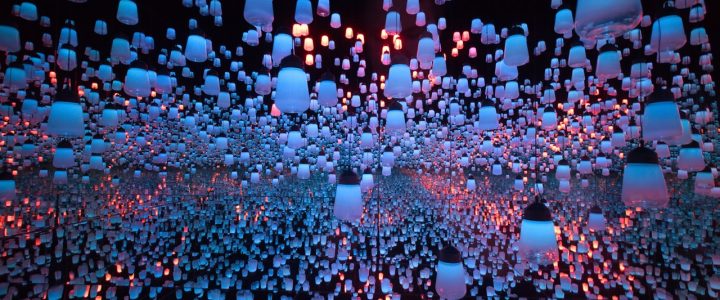

Art is always automatically linked to self-expression when it’s more than just that. Artists don’t only exist in art galleries and exhibits. With web design, however, you can see the same artistic sense that an artist puts into his or her work, art is even present in the creators of things like coastal beach furniture. There is also the need to have artistic abilities and the initiative to take into consideration the aesthetics of the final product. But where does the line between an artist and a designer lie?

Art And Design Are The Same

If you look at these two entities from a visual perspective, they are not inseparable. In creating art, you need the talent of creativity and the ability to connect one idea to another. Apart from this, you also need to be able to convey a certain type of emotion through your art. Together, these elements help create a piece that is fresh and unique, but relatable. This is the same when you create a custom craft web design.

Web designers are artists in a way that they know how to put together bits and piece of technical ingredients in forming a unique product. But unlike artists who paint or create manual art, they put functionality at the top of their goals. This function needs to fulfill a certain purpose in order for the design to be usable. Therefore, web designers can still be called artists, but with a goal.

The Conclusion

Some people may agree that there is no definite answer as to how web design is an art form. But to sum it up, art is a huge factor in creating websites. Although web design may not specifically be art, it is still able to capture attention and pique feelings and senses in people, much like things like furniture and coastal interior design can do. It is made through the same process as visual arts wherein one thinks about the steps needed to take in order to finish the final product.

As a web designer, your goal is to make art that is made to attract potential clients and new customers. It would be pointless to build a website that is not able to engage with your target market. That is why it’s important to figure out the specific group of people you are making your web design for. The trick is to stay imaginative, innovative, and open to possibilities. Just like art.

How Technology is Shifting the Way Art is Made

technology lights

Technology is redefining artwork in an odd, new way. Works are made by people going via laser beams or via information accumulated on air pollution.

Where would the Impressionists now be with no creation of mobile paint tubes that allowed them to paint outside? Who’d have known of Andy Warhol with no silkscreen printing? The reality is that technology has been supplying artists with fresh ways to express themselves for a lengthy period of time.

However, over the last couple of years, artwork and technology are becoming more intertwined than ever before, whether it’s through providing new methods to combine various kinds of networking, enabling more individual interaction or just making the practice of art itself simpler. The introduction and use of cloud computing enables technology to transform to art in a personalised manner.

There is a series titled “Digital Revolution” that started earlier this summer in London’s Barbican Centre. The exhibit runs through mid-September and carries a “Digital Archaeology” segment which pays tribute to games and gadgets which maybe not that long ago dazzled us with their own invention. (Yes, a first version of Pong is there, presented as adorable antiquity.) However, the series also comes with a huge array of digital artists that are utilizing technology to push artwork in various directions, often allowing gallery visitors to participate with it in a multi-dimensional manner.

Here are some examples from “Digital Revolution,” of how technology is reshaping what artwork is and the way it’s created.

Let us begin with lasers, the brush stroke of so much electronic art. Among the more popular displays from the London series is known as “Assemblance,” plus it is intended to encourage people to make light structures and floor drawings by proceeding through coloured laser beams and smoke. The tendency for most people would be to operate independently, but the contours they create are far more delicate. If an individual nearby lumps in their arrangement, for example, it is very likely to fall apart. But individuals who collaborate with other people, even if it’s via an act as straightforward as holding hands, find that the mild structures they produce are equally more resilient and more complicated. “Assemblance,” by Usman Haque, among the creators of Umbrellium, the London art collective which made it, says it has a sand castle quality for it, such as a rogue wave, a too aggressive person has the ability to mess everything.

Another popular exhibit in the “Digital Revolution” is an adventure known as “Petting Zoo.” Rather than rubbing adorable goats and furry rabbits, you get to cozy around snake-like tubes dangling out of the ceiling. A slab crane was not needed to set-up the exhibit but the use of slab scissors may have been. These are quite reactive tubes, bending and shifting and altering colours based on how they examine your moves, touch and sounds. They may pull back shyly if they feel a massive group coming or find all cuddly if you are being affectionate. And if you are just standing there, then they may act tired. The immersive art, developed by a design team known as Minimaforms, is supposed to offer a glimpse to the near future, when robots or even artificial pets are going to have the ability to browse our moods and respond in kind.

If Growing Colorspace, an abstract art painted onto the walls of a Berlin gallery, does not look so fantastic at first glance, simply give it a little time. Come back the following day and it’ll appear at least a bit different. That is because the painting is constantly changing, because of that a wall-climbing robot known as a Vertwalker equipped using a paint pen and an application instructing it to follow a particular pattern. The creation of musicians Julian Adenauer and Michael Haas, the Vertwalker, that resembles a flattened iRobot Roomba, is continuously overwriting its own work, biking through eight colours as it warms up perpendicular walls for two to three hours at a time until it requires a battery change. As explained by Haas, the method of production is ideally infinite.

Give Russian artist Dmitry Morozov a little credit, he has invented a means to generate contamination amazing, even though his objective is to make us conscious of just how much is on the market. He constructed a device, complete with a tiny bit of plastic nose, which utilizes sensors which can measure dust as well as other pollutants that are ordinary, including carbon dioxide, formaldehyde and methane. Then, he led out to the roads of Moscow. The detectors translate the information they collect into volts plus a computing platform named Arduino contrasts those liter into shapes and colours, making a picture of contamination. Together via it support services Morozov’s apparatus is able to capture still pictures from the scene and print them out. As irony would have it, the dirtier the atmosphere, the brighter the picture. Exhaust smoke may look especially lively.

How to Dress for an Art Event

two women walking

An art opening is a special occasion that requires you to carefully consider your own outfit. While dressing well is central, you might have to tailor your clothes to match the specifics of different openings. Gala events may call for a fancier dress code, whereas intimate galleries may better accommodate unique styles of dress which range from conservative to avant-garde and edgy.

Follow the Dress Code

Many invitations for gallery openings include a dress code for the function. If that is the case, it’s very important to adhere to the dress code specified by the gallery. If there isn’t any dress code stated, then dressy cocktail or casual wear is a safe bet. In all cases, avoid jeans, baggy shirts and boat shoes. While dress codes might not be strictly enforced by galleries, disregarding the dress code is deemed disrespectful — to the artist and into the gallery. Openings are special events that celebrate the hard work of an artist, so respect and consideration have to be shown by dressing in a suitable fashion.

Dress for the Gallery

For bigger museum openings, classic cocktail wear or even black tie is considered standard. In cases like this, conservative or traditional choices — the little black dress and a tuxedo are the best bets. With smaller galleries, you might want to more carefully tailor your clothing choices to the sort of opening. For example, LA-based stylist Lauren Messiah explains that dress options for uptown and downtown openings differ considerably. She indicates that a downtown gallery frequently features more contemporary-oriented artwork, so an edgier ensemble — like a coat with an asymmetrical cut for women — is much better suited. For an uptown gallery, where the art and gallery are more conventional, top and skirt — or jeans and a button-up shirt for guys — may be more fitting.

Dress for the Occasion

The more exclusive the opening — if it’s personal or by invitation only — the more upscale the dress requirement could be. For guys, this may mean wearing a suit and tie instead of simply a dress shirt and slacks. For girls, this is an opportunity to pull out the sparkly cocktail dress or the elegant silk slip dress in your closet. Occasions that require a black tie dress code will clearly state so on the invitation – like the opening of a major museum.

Shoes and Bags

Choosing the perfect footwear is essential for an opening because you’ll probably be walking and standing in crowded conditions for an extended period. As a result of this, comfortable footwear that will make it possible for you to move around easily — without danger of tripping or slipping — is vital. Therefore, no matter how stylish your strappy heels might be, aim for lower heels unless you’re positive you’ll be comfortable in stilettos for many hours. Last, see that the opening will be crowded and there might be little room to move around. Therefore, leave your oversized handbag behind and decide on a small clutch, which makes it easier for you to walk around the gallery without the danger of hitting a piece of precious art.

The Art of Cloud Programs

computer on desk

Do you ever find it difficult to manage your own business, or artwork whilst on a busy schedule?
In Art Cloud you can easily track and manage your own artworks, create new pieces, email invoices with your logo on them, make certificates of authenticity for any art, make consignment reports and sales reports, and track all of your client contact information as well as their birthdays. Inside your customer list, each customer’s email is clickable and easy to manage; once you click on their email address within Art Cloud your default email service will open up a new email to that contact; meaning no need to change in and out of windows and platforms. Furthermore, Art Cloud can power your site so that your stock is always in sync. With Art Cloud you can incorporate your current site to dynamically pull information from your accounts. By way of instance, if you add a new piece of art, then your website will update automatically.

Art Cloud is an online art gallery that uses a cloud management system program for galleries, artists, collectors and advisers. I began using Art Cloud this week, and first and foremost I find this system simple, and easy to use. Their how-to guide comprises simple and easy to read, and to follow directions. That is a huge plus for me. (There is nothing more frustrating than searching for help with a site feature only to experience endless text to read.)

I have looked at several inventory cloud management programs previously, and of course the very best attribute of Art Cloud is that there is not any software to purchase or to keep updated, no updates to buy, without needing to later move the whole system to another computer after years of entering your information. So right away, when using this program, your life is simplified. You are working in the cloud inside your own password-protected profile. You can connect anytime from anywhere using your Mac, PC, telephone, or tablet device with an online connection. With Art Cloud you input your information and upload your pictures– once– for numerous uses. On a fundamental level, it lets you control your art inventory, customers, and invoices in one clean interface that’s highly integrated. This integration will help you to conduct a more efficient and therefore potentially lucrative more business.

Other time saving and amazing features include their Virtual Revenue Assistant tools. On the homepage (after you login), you may notice that Art Cloud recommends certain actions that will help you drive more sales. For instance, Art Cloud will give you information about your newest and most recent customers, or recommend that you get in contact with customers who recently celebrated a birthday. Art Cloud even builds profiles for your customers and recommends which collectors may be interested in new artworks based off a simple to use tagging system.

Additionally, a few interesting features that may not be evident to the naked eye on first trip to Art Cloud:

While in your inventory list of your artworks, click on the name of any piece along with a tear sheet will create which you may save as a PDF and email to a gallery or customer.

Tags; these are your very best friend in Art Cloud. Tag each artwork or customer or contact with an infinite number different word descriptors for remarkable search capabilities.

The listing feature is not only good for price lists and wall tags, but it is an excellent way to make a list for consignment to a gallery.

How to Give Your Home That Coastal Vibe

luxury home on coast

Australians are blessed with kilometres of coastline, so it is natural we love that same beachy, relaxed vibe in our own homes. There are a number of simple ways to create a trendy coastal style regardless of where you’re located, creating a space you won’t want to leave. Textures and patterns work well for this specific style, as they add interest without the need for strong use of colour.

Instead of making bold statements, muted and washed tones mixed with natural components complement the appearance. Consider piles of cushions, throws and large floor cushions for those lazy summer afternoons (subsequently restyled to maintain the coastal appearance in winter). Here, the important points you will have to help you transform you home into a coastal retreat.

BEACHY COLOURS

A sure winner of the coastal or beachy feel is a background of white or neutral tones. Milky whites or vanilla tones work flawlessly to create a cool, tranquil background, allowing your colours to subtly pop.

Consider muted shades of blues and greens – even a simple navy will suite. You may introduce your colours with accessories and furniture, allowing your neutral theme run through the space in walls, ceilings and woodwork.

COASTAL FURNITURE

Large lounges with neutral-tone slip covers are an excellent choice to fall back on and enjoy with the whole family and the removable covers will give you piece of mind of having white furnishings.

Larger pieces, like sideboards, work well in washed grey timber tones, creating that aged effect and cause them to feel lived in and comfortable. Introducing a few white or white-washed pieces will make the room feel like the beach house we all crave.

COASTAL DECOR (IT’S MORE THAN SHELLS)

There’s no need to go overboard with shells and pieces of driftwood to create that relaxed coastal vibe. Rather, a subtle nod to this style will have more impact. Washed-back picture frames, big glass bowls or bottles and vases in teals and blues all work to set the tone.

Rugs are also ideal as they provide a means to introduce texture and colour. Open-weave rugs in natural fibres work nicely in almost any room for great coastal interior design

TROPICAL INDOOR PLANTS

Large indoor plants work so well for that coastal vibe, blurring the lines between inside and out.

Large plants with glossy and broad leaves help create the island-paradise tropical feel, while the deep greens sit very nicely with the whites, neutrals, blues and washed greys. Colourful and tropical flowers in large pots help add a lush and vibrant look and feel, while still providing some additional drama to the space.

BEACH HOUSE BREEZE

One of the simplest ways to offer a coastal vibe would be to open up your windows and allow the natural light in. Take down those heavy winter drapes and replace them with soft sheers, and let them move with the breeze.

If you have the budget, add some plantation shutters or the cheaper alternative of wide-blade venetian blinds to control the light on warmer days.

Past Forward Through Architecture and Design

architectural design

There are old favourites, like Daniel Burnham’s sweeping vision for Chicago. And you will find unexpected gems, such as the glistening prefabricated kitchen and bathroom components of a French architect intent on creating once-elite ski resorts cheap to the masses.

These are one of the eye-catching objects in the Art Institute of Chicago’s new installment of its permanent structure and design collection. It’s one of the most extensive exhibition installations the museum has ever showcased of its vast holdings in these areas. But the objects alone are not what make the show worth seeing.

Rather, it is the ability with which the bits are framed within a larger narrative of how design and architecture have shaped — and continues to shape — how we live. While there are a number of lapses in that narrative, the exhibition, titled “Past Forward: Architecture and Design at the Art Institute,” is, for the most part, has been intelligently told.
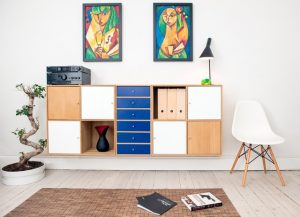
Throughout, a major theme is that interior design and architecture are idea-driven Fields participated in the making of experimental visions, not only the real reality of a brick bungalow or a tubular steel chair. That cerebral view will probably provoke a world-weary dismissal from individuals who’ve witnessed the costs, both financial and human, of designers’ failed visions. Think demolished public housing projects. But there’s no denying that the radical, often uplifting impact that design and architecture have made throughout the past 120 years.

The Show, to its credit, explores both sides of the coin.

Organized by Zoe Ryan, the museum’s chief architecture and design curator, “Past Forward” occupies the majority of the design and architecture galleries at the museum’s Renzo Piano-designed Modern Wing. (The remainder of these galleries will be dedicated to temporary museum showcases and displays).

As in the rest of the Modern Wing, the exhibited material — drawings, sculptures, pieces of furniture, posters, videos and much more — covers the period from 1900 to the present. It’s the first time, Ryan said, that the museum has collectively exhibited its holdings of modern and contemporary architecture and design. They amount an estimated 250,000 items.

However, this is a different type of permanent installation. A few of the show’s contents, particularly light-sensitive architectural drawings and fabrics, must only be exhibited for a few months at a time to prevent fading. So go now if you want see a drawing such as Ludwig Hilberseimer’s chillingly enchanting 1924 vision of a town whose residents reside at high-rises and work in factories right below.

The instalment — made by Julia Di Castri, who teaches at the University of Illinois in Chicago’s architecture school — neatly accommodates the demand for the exhibit’s ever-changing contents. In the deal, it underscores structure’s unique capability to frame space and provides visitors multiple paths throughout the show.

Diagonally organized, 12-foot-high walls produce a compelling tension with the odern Wing’s right-angled geometry and form a collection of room like spaces which contain the show’s thematic sections. Openings in the walls create alluring, down-the-alley perspectives that showcase prime display material, such as a multicoloured, stencilled wall covering by Chicago architect Louis Sullivan.

The best of the segments make fascinating connections among their subjects and the world at large. The one on offices, as an instance, demonstrates how the expansive, column-free insides of innovative structures such as Skidmore, Owings & Merrill’s 1955 Inland Steel Building in Chicago pushed designers to create lighter, more flexible office environments. Unfortunately, one such attempt flopped, resulting in the lucid wall text notes, to what we now know as the omnipresent and dull cubicle.

A more pleasing outcome can be seen from the aforementioned prefab kitchen and bathroom units, which French architect Charlotte Perriand designed in the 1970s for the Les Arcs ski resort in the French Alps. The fibreglass units were plugged into small apartments, holding down prices and helping to democratize a formerly exclusive leisure activity.

“Past Forward” also succeeds in pulling back the curtain on how architects change their theories into material reality; a process well illustrated by architect David Adjaye’s drawings and mock-up versions in the National Museum of African American History and Culture. And we see design’s importance in shaping a city’s image, evident in the artfully simple posters that the modernist graphic designer John Massey failed in 1966 to promote Lincoln Park and Lake Michigan.

Still, there are flaws, and they are partially rooted in the fact that curators are like card players — they need to play the hand they are dealt.

The Art Institute’s design and architecture holdings, as extensive as they are, aren’t all-encompassing, which leads to a frustrating gaps. The section on modern museum interior decorating, as an instance, has nothing to say about the powerfully sculpted, digitally enabled museums of Frank Gehry, whose Guggenheim Museum in Bilbao, Spain, dazzled the world and changed the course of museum design when it opened 20 years back.

Even if the collection is powerful, it’s not always well-handled. The show’s treatment of postmodernism is fragmented and unfocused. Stanley Tigerman’s iconic “Titanic” collage, which portrays Ludwig Mies van der Rohe’s Crown Hall sinking into Lake Michigan, appears in one section while some of the postmodern “Late Entries” into the Chicago Tribune Tower competition of 1922 are in another. Considering that the current resurgence of interest in postmodernism, the show’s inability to draw together these essential pieces is a disappointment.

Some of the design items on screen seem somewhat kooky, despite their provocative contemporary relevance. A seat, shaped like a cow’s chest, which reminds us of the animal origins of leather furniture? Such designs bring to mind Mies’ famous line: “I do not wish to be fascinating; I wish to be good.”

It’s much more moving to see among the moulded leg splints which California Designers Charles and Ray Eames developed for injured soldiers during World War II. The splint was a substantial step toward the sculptural moulded plywood furniture which the Eameses designed after the war. Architecture and design are at their best, this example indicates, when ideas are not imagined for their own sake but to enhance and elevate human expertise.

Why Art and Wine Mix

art and wine

I’m resting my elbows on an unvarnished, paint-stained dining table in a comfy craft store and I am hoping a nude man appears any moment now. Surveying the A3 paper, paintbrushes and assorted kinds of pencil, I am distracted from the giant glass entry doors. ‘Will not those who pass by, you understand … see?’ The teacher smiles and says: “Life drawing happens on Tuesdays. Tonight, we are drawing fruits from the nearby fresh food store.” Why I presumed every Drink and Draw course would involve a nude model is most likely best left to your psychoanalysts.

Drink and Draw discovered popularity firstly in New York Lately and today the tendency was imported into most developed nations including Australia. True to its title, this can be an art course for both the experienced scribblers and clueless newbies — but with the pairing of a classic artesian ale or wine from the yarra valley.

Art and alcohol can be a fantastic combination; it assists individuals with their inhibitions. A blank page may freak out people. When you’re ready to get beyond that and just get something on the paper, it becomes much simpler. Mixing drinking, socialising and drawing is not fresh: boozy art collectives had been a fixture of 1920s Paris. In addition to getting you over the hump of putting pen to paper, understanding alcohol forms a portion of this course eases that very specific concern; conversation may be stilted.

Joni, a science teacher, says that she wanted to reserve an artwork course but was daunted by six-week obligations and phrases such as “tuition”. She believes having ‘beverage’ in the name makes it seems relaxed and not as severe.

Art and alcohol could be a great combination; it helps individuals with their inhibitions

Folks start filtering in, introducing themselves as though they were mingling in a friend’s house party. The first to arrive is Victoria, a young mother on maternity leave from her job. Her husband booked the course as a gift so that she could have an artistic night-time off. She says: “When I was working I kept saying I needed to do something artistic to unwind, but I never got around to it.” Sitting beside me is Jenny, a policy advisor for a charity. She’s never attracted before but is trusting her A* in GCSE pottery will establish an advantage.

After the table is complete and beverages are poured; tonight’s featured wine is a Merlo from a yarra valley winery; Jude admits an ice-breaking game of Pictionary. Both teams compete for some strange bars—Presumably from the same fresh food shop as the fruit, not as hence the stakes are damn high. Here, the actual artists have the advantage over novices: my attempt with an elephant resembles a very specific portion of the male anatomy, whereas an applications engineer, Ben — that asserts that “signing my touch is the only time that I pick up a pencil” — manages to communicate a lion with a squiggly circle. My elephant needs to have scarred him, however, because when a person pulls a mouse with a long tail his very first suspect is “a semen!” The match finishes, after much laughing, at a draw. Fruit bars for everybody!

The allure of this course for everybody is to return to something they loved when they were younger.

Past the beverage, most men and women tell me, that the allure of this course is return to something they appreciated when younger. Just about everyone says they enjoyed art at college, lost touch to it and are trying to reconnect.

The instruction is impressive. We’re taught the Fundamentals of Drawing: how to summarize, how to color using pens and cotton buds — without the presumption of present abilities or natural splendour. And the Outcome? Well, nobody believed my peacock feather was a semen. I predict that an achievement.

And in one of the chatter, joking and reinforcement, some of my classmates create stunning drawings. And, given my complete lack of ability, mine is heaps easier than anticipated. But is that down to reduced inhibitions and very good instruction, or wine skills? Perhaps that is the beauty of Drink and Draw — Never needing to understand.

Architect Recounts his Encounters with the Masters

architect skyline

It was compulsory for architects to make the Grand Tour of the greatest buildings and historical monuments of Europe. This was both for people residing in Europe and also for people starting out of the side of the Atlantic. The aim was to return home with measured drawings  and architecture photography of significant buildings and then replicate those honored structures or their details, be they in the Roman, Gothic, Renaissance or Baroque eras.

Though this Beaux Arts requirement waned long ago, the Grand Tour is still accepted by architects now. Actually a whole issue of the Yale Architectural Journal (Issue Number41 – 2008) was dedicated to the effect of this Grand Tour on architects like Chestnut Hill’s very own Denise Scott Brown and Robert Venturi. But now, architects out of the continent also fly into the U.S. to find buildings of importance.

Let us be clear: many architects travel to see the buildings made by the Masters – but a single architect trained in Germany actually traveled into the U.S. to meet with the masters themselves, having met many in his own home state before emigrating here. Otto Reichert is a tall, distinguished-looking guy, very cultured and well-spoken, currently living in Chestnut Hill in a vintage home with classical house extensions. Now in his 90s, he’s retired and walks with a cane. He and I love regular conversations about politics, design, and history whilst sunning or swimming in the Hill House pool.

Back in 1950, Otto obtained a degree from the Technical University in Karlsruhe, went to Columbia University, then got his degrees in city planning and architecture at Harvard. Through time, by accident, fortune, or persistent pursuit, Otto participated with a few of the very creative and effective styles of the 20th century.

In response to Otto’s cold telephone in 1951, the world-renowned architect of this Seagram’s building on Park Avenue, Mies van der Rohe, encouraged Otto to return to Chicago for a four day tête-à-tête. Otto was more than surprised to discover Mies’ whole office no bigger than a living space away from an architect’s stereotypical environment of drake low loaders and crane hires. Mies sat behind a normal drafting board (no desk), as though Mies was a mere worker rather than a world-revered master. As unexpected, there was only an office supervisor (an aristocratic Baron of a kind) and 2 draftsmen.

Mies and Otto took walks across Lake Shore Drive and would stop to watch Mies’ restrained, grid-like apartment homes then constructing single storey additions. At one stage, Mies, the stoic, abruptly exploded in anger when speaking to some Swiss critic who maintained that Mies had misplaced the architectural energy he’d exhibited throughout his Berlin period. Before supper, Mies and Otto both had three martinis; Mies, Otto explained, could have kept moving. Alcohol was as near Mies’ heart as his ever-present cigars.

Otto was thrilled when Mies led his assistant to take Otto to find that the striking and famous Farnsworth House, then under construction across the Fox River at Plano, Ill. This was a memorably first, floating quantity of glass and white painted steel from the largest slab cranes of the region, built as a country retreat. Despite a litigation instituted by the customer (with whom Mies had experienced a romantic liaison), the home remains a masterpiece of mid-century modernist thinking and is presently possessed by the National Trust for Historic Preservation.

In the Union League in Philadelphia, Otto once had lunch with the famous Swiss architect, Le Corbusier, and some other Harvard-trained architects. Otto explained that Corbu’s small stature was in stark contrast to his standing among the very influential artists/architects of this 20th century. The attached photograph is his sculptural chapel at Ronchamp, France, taken by an architectural photographer in 1973. During the luncheon, the hugely famous Corbu nonchalantly reported that he was usually the last to leave the workplace and carry out the garbage.

In 1957 Otto had a short exchange with Walter Gropius beneath a full moon on the staircase leading up to the Acropolis at Athens. Gropius, always the teacher said that these people would for no real reason walk in silence round the Parthenon. If architecture could do that, it has fulfilled its mission.

In contrast to this reserved Mies van der Rohe, Otto describes Richard Neutra with his bulk of silver hair (that Otto recognized, he often uttered) as a totally charming, bubbly Austrian. Neutra is famed because of his California homes with large expanses of glass which married the inside together with all the beauty of the California landscape.

Otto worked with Oskar Stonorov on the Plan of Hopkinson House at Philadelphia. Oscar was also a sculptor and adored literature. In Stonorov’s passing, Otto and Philadelphia’s very own Louis Kahn reminisced for 2 hours about the guy they both had admired and adored. Otto worked with Harriet Pattison, among Lou Kahn’s partners. She had been a landscape adviser on Otto’s Academy House job in Center City.

Space doesn’t allow complete reference of the other architects and artists which Otto engaged with during his lengthy career, but this is a simple list to give you some concept of the broad horizons of his cultured life:

Dean G. Holmes Perkins (School of Architecture at Penn); Architects: Philip Johnson; Pietro Belluschi; Erich Mendelsohn; Otto Ernst Schweizer; Egon Eiermann; Frei Otto; Hans Scharoun; Artists+: Harry Bertoia; Sam Maitin; Charles Searles; Joan Miró; Vincent Persichetti; Eugene Ormandy; along with Anne d’Harnoncourt.

The world would be richer if Otto Reichert-Facilides had enough energy and time to compose a full size memoir!

Plumbing Museum App Supports Art Industry in Watertown

plumbing pipes

The Plumbing Museum has declared the ribbon-cutting and launch of the Manoog Family Artist in Residency Program, a new cultural initiative being provided to the Watertown and Greater Boston communities.

Designed to encourage careers in both the arts and trades, the program provides artists with the physical and financial resources required to explore the relationship between art and industrial engineering. Named after the founding family of the Plumbing Museum, the Manoog Family Artist in Residency Program offers artists the chance to harness their passion and imagination to generate significant artwork, develop their skills and give back to the community, all over the space found at the Plumbing Museum and its partner organization, J.C. Cannistraro.

As part of this program, selected artists are supplied with complete access to studio workspace, fabrication and welding tools, materials and a cash award. The program’s first resident artist, Ryan Leitner, is a recent graduate of Tufts University School of the Museum of Fine Arts, Boston. The autumn residency will conclude with an exhibition at the Plumbing Museum in January 2017.

At home in Australia, it’s not surprising that the plumbers who made an “Ettamagoh” dunny to race at the prior dunny races in the Warrnambool Talent have created a “Cistern Chapel” pipes museum themselves. Warrnambool plumbers Tony Van Rooy and Brian O’Shannessy obviously enjoy a little fun but their Cistern Chapel is significantly more than dunny humour.

The group of plumbing paraphernalia reveals how changes in plumbing technology have made life much easier and highlighting previous plumbers’ abilities as well as the risks they faced. Mr O’Shannessy said he initially believed his buddy Tony’s pastime of collecting plumbing paraphernalia had been “stupid” before he caught the ‘art collection’ bug and joined him in a few collectors’ rallies.

The collection grew and both got a site at the South Western District Restoration Group’s centre that’s next to the Cobden Miniature Railway and Mini Golf Park. In the true spirit of the old plumbers who were ingenuous in repairing things, they recycled a corrugated iron shed from neighboring Dixie to make a home for the makeshift museum.

It houses everything from old nighttime soil cans and architectural engineered timbers to elaborate ceramic and metal piping configurations as well as the major array of different varieties of toilet cisterns the museum is named after. Other displays include round the corner chisels and coin-operated gas meters. Most haven’t been restored to increase the allure of their era.

Tony, 67, and Brian, 62, have been plumbers for several decades and know the tales behind lots of the things including the inspiration for the saying “as flat as a shit carter’s hat” At the time before sewer pipes were set up, night soil carters took off the bathroom cans from backyard bathrooms.

They carried the cans in their shoulders and the hats they wore to protect their heads from spillage and possible corresponding gas installations frequently wore flat. Lots of the museum’s displays are over a hundred years old like a water main made from stainless steel slats bound with wire. When the absorbent wood became wet, it swelled to become waterproof.

The displays elicit lots of laughs and stories from visitors about their experiences with similar products. Comic signs like “Old plumbers do not die, their plungers only perish” and a “Plumber’s Poem” add levity to the museum. Old wooden bathroom doors under laminated structural timber beams have a new function as display boards for ranges of taps. The plumbers delight in opinions in their guests’ book saying that the museum is “a shit place” or something similar. But while they could laugh about their work, they said it was clear improvements in youth had supplied big improvements in quality of life.

“Prior to a flushing toilet was really easy,” Mr Van Rooy said. But even with each of the technologies and essentially blocked plumbing and drains or burst pipes, he stated meeting his clients was among the best parts of his job. The chance to meet people was why he loves doing maintenance plumbing in a form of art as opposed to construction. Mr Van Rooy said while plumbing sometimes involved getting into unsanitary circumstances, plumbers were generally able to keep “from the shit.”

Hanging Tips For Your Art Display Show

coloured pencils

Installing a solo art show of your own work is a challenging and fulfilling job. A solo show is most likely something you have actually worked toward for a year or more to showcase your art under stunning art hanging systems. You have a significant psychological investment– and frequently an economic one as well– in its success. If your program remains in a museum or industrial gallery, installing the show will probably be the responsibility of the museum manager or gallery director. But if your program is in a co-op gallery, art association, alternative art area, library, bank, restaurant, office space or your own studio, part or all the duty for arranging and hanging the work will most likely fall on your shoulders. Checking out the installation procedure will help you create a cohesive exhibition that will show your work to its finest light.

Things to think about

The very first obstacle is to acknowledge that, while the works you have actually produced for the exhibition are the factor for the program, the exhibition is not about the works. Rather, the exhibition is a work of art unto itself. Your artworks are just one element of that larger work– the exhibition.

Creating an exhibit is a multidimensional procedure. Amongst the elements that add to a success or failure are the exhibit area, the lighting, the audiences and the method they will move through the space, visual interruptions that are inevitable, focus on your primary purpose for the exhibit, the mechanics of how the artwork will be hung, and the plan of the pieces.

The area

Start by clearing the space as much as possible. Even if there are pedestals, chairs or other furniture that you envision you’ll use in setting up your exhibit, remove them at this moment so you can see the area with as few diversions as possible.

When the space is empty, analyze your environments. Is there any natural light? The number of entryways and exits exist? Are there any pillars, unmovable dividing walls or other blockages in the space? Do the walls need to be touched up from the previous picture hanging systems? Is the ceiling high or low? Is there adequate lighting? Exists anything in or near the area that will take on your work for the audiences’ attention?

After you have actually resolved these questions and other that strike you, it’s time to bring your works into the area– if possible, into the center of the area. Don’t lean the works against the walls at this moment– they’ll end up being an obstacle to visualizing the very best possible layout of your show.

Oil Painting Lessons on Various Topics

oil painting

Being the most popular medium due to its forgiving nature, many of the artists wish to learn to oil paint as a means of self-expression and creativity and with this intention in mind, enroll for classes wherein they can expect to learn the different oil painting techniques from the maestros of the field. In this respect, the student might as well bear in mind the fact that like all new activities oil painting also needs to be learned from scratch and that there is no short cut which would enable one to become an accomplished oil painter overnight. However, joining oil painting lessons would undoubtedly speed up the process as one would get an opportunity to learn to oil paint by incorporating the various oil painting tips imparted by the guru.

Initially, while oil painting how to paint landscapes, seascapes, animals, and flowers forms the content of the oil painting lessons as instructions pertaining to the various oil painting techniques employed for painting these subjects are imparted to the student artist. Landscape, being the easiest, is not only the most common but also the first to be handled by beginners by utilizing some of the traditional oil painting techniques. While painting a landscape with oils, the student is instructed to start from the sky and gradually move downwards. This is not only in keeping with the light to dark rule but also entails the application of the wet-in-wet technique. One way of imparting depth to landscape oil is to paint the farther objects in light colors and the closer details in dark colors.

Attempting a seascape is comparatively a more challenging task but certainly not impossible to achieve for a dedicated student who believes in a lot of practice. Seascapes are best painted by utilizing the wet-on-wet technique which entails the application of wet paint on top of another wet paint so as to create soft edges and proper blending of different colors. Seascape is usually replete with clouds, foam, waves and beaches and sometimes a lighthouse as well all of which can be depicted by maintaining a certain angle of the brush stroke. A beginner needs to remember that while painting a wave, the inside of the wave requires an under curve brush stroke whereas the top of the wave requires an overhand.

Painting animals is a more complex task as one needs to keep in mind details like long fur, short fur, eyes and the overall proportion. In this regard, one of the noteworthy recommendations pertaining to making an oil painting of animal is to copy from a picture and try to produce the closest possible replica in terms of the mood, theme, and expression of the particular animal or a bird. This would not only provide the artist with practice in various techniques but would also make him versatile. Likewise, for painting flowers, one would need a vast array of colors and a combination of several techniques in order to be able to acquire the desired result.

Having mastered most of the traditional techniques through these basic subjects, one can then graduate on to more complex subjects and even oil painting as an outlet for one’s dreams and fantasies.