The Role of Art in Commercial Spaces

commercial interior design Melbourne

Art has a big role in making commercial spaces look amazing. But it’s not just there for show – it can also make a place more practical and improve how it feels. In Melbourne, designers use art to create chill vibes and make everyone feel connected, whether they’re customers or employees. So if businesses want to step up their game and improve their physical presence and brand identity, they need to recognize how important art is in commercial spaces.

Enhancing Brand Identity

Art in commercial spaces has a big job – it should show off the company’s brand identity. Interior designers for businesses pick out pieces of art that match the brand’s personality, values, and style. In Melbourne, where design and culture meet up, art is like a storybook that helps brands visually tell their story. For example, a tech company might hang modern, abstract art in their office to show their creativity and innovation. A law firm, on the other hand, might choose more traditional, calm art to show that they’re dependable and trustworthy.

Creating an Inviting Atmosphere

Choosing cool art for a store or a workplace can make a big difference in how people feel in that space. It can turn a dull or plain area into something more exciting and welcoming. People who design stores and offices are good at picking out art that goes with the colours, furniture, and overall design. Walking around Melbourne, you might notice some stores have crazy and colourful art that catches your eye. This art is great because it brings people into the store to check what’s inside.

Improving Employee Wellbeing and Productivity

Art can do wonders for our wellbeing and productivity, you know? It can even significantly boost employee morale and productivity in offices. Putting up some thought-provoking or nature-inspired art can help reduce stress and increase creativity and motivation among staff. It’s common for commercial interior designers to incorporate art into workplace designs to create a more pleasant and exciting work environment. In Melbourne, you can find many office spaces with art galleries that provide employees with spaces to relax and find inspiration.

Differentiating from Competitors

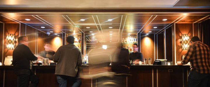
Companies constantly look for ways to stand out in a competitive business landscape. Unique art installations can serve as a differentiation point that sets a space apart from its competitors. For restaurants, hotels, and other hospitality venues, art can become a landmark or a talking point that enhances the customer experience and leaves a lasting impression. Commercial interior designers are instrumental in sourcing and installing these unique pieces that embellish the space and add to its uniqueness.

Contributing to Cultural Dialogue

Art in commercial spaces can contribute to broader cultural dialogues, reflecting societal themes or local heritage. This is particularly prevalent in Melbourne, where commercial interior design often embraces local art to celebrate community and history. Art installations can serve as platforms for social commentary or community engagement, adding depth and context to the commercial space. This enriches the customer’s experience and embeds the space more deeply into the fabric of the local culture.

Adding Value to Properties

Art can significantly increase a property’s perceived value from a real estate perspective. Beautifully curated spaces are more attractive to potential tenants and buyers, often justifying higher rents or sale prices. Commercial interior designers use art to enhance a property’s physical appearance, making it more appealing in real estate listings and during viewings. Art can give commercial properties a distinct advantage in cities like Melbourne, where property markets are fiercely competitive.

Integrating art into commercial spaces is a fancy process that needs a good sense of what looks and works well. Commercial interior designers are the ones who make sure that the art they choose goes well with the design and makes the place look and feel better. In Melbourne, famous for its artsy vibe and innovative commercial interior design, art has become an essential part of commercial spaces, turning them into more than just places for business but creative, cultural, and community hubs. As more and more companies realise the value of art in commercial spaces, the collaboration between art and commercial interior design Melbourne is expected to become even more robust, creating more successful and dynamic commercial places.

The Best Hospitality Designs In Sydney?

The Best Hospitality Designs In Sydney?

Australia has many beautiful places, and there’s no doubt in that fact. However, the hospitality sector including hotels, cafes, restaurants, and hotels make full use of these places. Take for instance this luxury accommodation in Tasmania, which designs its interior and hotel packages around the natural environment it is surrounded in. Cafes and restaurants are not simply outlets for refreshments. Most of these hospitality places are decorated with attractive designs and creative concept. They have been put together by interior designers, architects, and project managers. We shall look at bespoke hospitality designs for a place in Sydney. 

Why Hospitality Designs Important?

The perception of any business is stronger if entrepreneurs create unique brands of hospitality designs. So, the hospitality interior should be unique with eye-catching visual elements. Most people can’t eat or drink without appreciating the beauty of the interior space. A serene cafe, a restaurant or bar with custom furniture and minimalist design can evoke a pleasant emotion in customers. Just take a look at how well-designed this fine dining restaurant in Hobart and how highly-rated this place is. There has to be a correlation between the two. Also, the use of well crafted interior designs in hospitality venues adds value to the business.

Interior design in hospitality centres primarily on service businesses including hotels, restaurants, cafés, bars, fitness clubs, lounges, spas, and state clubs, amongst others. The scope of work, budgets, and space preparation can be quite complicated, so designers working in hospitality require quite a bit of responsibility and has to be quite thoughtful with their design decisions.

Hospitality is one of the biggest industries on the planet…and it is also among the most important branches of the commercial layout. There are numerous luxury hotels across Australia from Hobart to Perth. In today’s post, I explore the booming hospitality sector and show why interior design plays a central role in service-driven companies.

Hospitality or commercial designers need to elevate spaces with a specific style and disposition in mind while also maximizing a space’s performance for financial gain. If it comes to lodging interiors, business comes first! Commercial interior designers in the hospitality fieldwork in tandem with architects, contractors, and manufacturers to guarantee all physical structures and architectural factors are aligned with the client’s vision and business requirements.

Fusing luxury with performance

Hotels, spas, and other support ventures have a number of the most beautiful and lavish interiors. A seasoned hospitality contractor knows how to strike the balance between luxury and top-notch functionality to make spaces which both business owners and customers will love. This is incredibly important for businesses seeking to make a fantastic first and lasting impression like in hotel inside design where this balance plays a significant part in the consumer experience.

Whether it’s a romantic lounge in the middle of Melbourne CBD or some sophisticated dinner place in Hobart, then each hospitality business needs a design to accommodate a specific a number of patrons whether it wants to optimise earnings. But, service-driven companies must also incorporate certain features and amenities if they’re going to excite and inspire clients.

A hospitality designer is also responsible for helping company owners with:

  • Lighting
  • Window Placement
  • Floor and Ceiling Design
  • Smart Technology
  • All Other Architectural Details.

They then need to create an aesthetic that meets the needs of the business through fabrics, art, colour schemes, furniture, window and wall treatments, high-end finishes, and accessories, and must also make sure each room is secure and up to code.

The Best Hospitality Designs In Sydney?

Some of the Best Hospitality Designs 

You might not like to make unnecessary interior design mistakes if you are a hospitality operator. So, using minimalistic designs for interior spaces is ideal for most hospitality venue owners. One of the best, high-end romantic getaways in Tasmania, for example, is a good example of a space that uses minimalistic design. Before hiring the right designers, ask them for references to their previous jobs, and check their online portfolio. Usually, clients ask their design contractors for proposals to evaluate their see completed projects. It’s only a functional café or restaurant design that complements your business vision.

Visit the Barangaroo House with Cantilevered Balconies

One of Sydney’s breath-taking waterfront destinations with multiple balconies is the Barangaroo House. Generally, this 3-tier balcony structure has ample spaces for cocktails, meals, and snacks. At the Barangaroo House, you can enjoy a range of Australian cuisine and wine. The three-layered edifice has rooftop bars with decorative elements like flowers, and it’s beside a skyscraper. This creative concept was initiated by the Rogers Stirk Harbour and designed by the Collins and Turner studio. From a distance, handmade-like (woven) balconies look like overlapping baskets. Also, the bar design allows customers to enjoy scenic views from the harbour. 

What is Special about This Hospitality Design?

Taking a close look at the major hospitality design of this building, we saw that these three-layered balconies are made from Accoya (pine) plant. It’s a strong, water-resistant wood that has been treated with a dark finish. Generally, the sophistication of every design element in this building makes you want to come back for more treats. Apart from the House Bar on the ground floor, the Barangaroo House’s first floor has a special restaurant called the Bea. This restaurant is open for everyone from Mondays to Sundays. The rooftop bar (Smoke) closes at midnight, but you’ll enjoy the cool breeze from the sea.

In Sydney, there are stylish restaurants and trendy cafes, but the Barangaroo House’s hospitality design is the best. You can’t miss the sight of its curved, structural plan and ample space. As its terraces and facades overlook the waterside, this architectural masterpiece creates an appealing sense of design in the minds of onlookers. In a way, this design is comparable to this luxury accommodation in Tasmania, which is already known for its pleasing interior aesthetics.

Architects and designer use bespoke hospitality designs to help guests unwind, enjoy great-tasting meals and drinks. You’ll also see decorative layered lighting fixtures inside the Barangaroo House. The effects of well-designed lights often make interior space very welcoming and comfortable. It’s a great way to relax in Sydney when you need great waterside meals and drinks.

There’s a cafe that offers outdoor dining and sunset cocktails in this magnificent building. During the weekend, it’s filled with people from all walks of life that want to have fun. You’ll see decorative items like hanging installations and raised planters on the cafe’s balcony and walls. The structural framework of the entire building makes an amazing physical presence too.

How to Give Your Home That Coastal Vibe

luxury home on coast

Australians are blessed with kilometres of coastline, so it is natural we love that same beachy, relaxed vibe in our own homes. There are a number of simple ways to create a trendy coastal style regardless of where you’re located, creating a space you won’t want to leave. Textures and patterns work well for this specific style, as they add interest without the need for strong use of colour.

Instead of making bold statements, muted and washed tones mixed with natural components complement the appearance. Consider piles of cushions, throws and large floor cushions for those lazy summer afternoons (subsequently restyled to maintain the coastal appearance in winter). Here, the important points you will have to help you transform you home into a coastal retreat.

BEACHY COLOURS

A sure winner of the coastal or beachy feel is a background of white or neutral tones. Milky whites or vanilla tones work flawlessly to create a cool, tranquil background, allowing your colours to subtly pop.

Consider muted shades of blues and greens – even a simple navy will suite. You may introduce your colours with accessories and furniture, allowing your neutral theme run through the space in walls, ceilings and woodwork.

COASTAL FURNITURE

Large lounges with neutral-tone slip covers are an excellent choice to fall back on and enjoy with the whole family and the removable covers will give you piece of mind of having white furnishings.

Larger pieces, like sideboards, work well in washed grey timber tones, creating that aged effect and cause them to feel lived in and comfortable. Introducing a few white or white-washed pieces will make the room feel like the beach house we all crave.

COASTAL DECOR (IT’S MORE THAN SHELLS)

There’s no need to go overboard with shells and pieces of driftwood to create that relaxed coastal vibe. Rather, a subtle nod to this style will have more impact. Washed-back picture frames, big glass bowls or bottles and vases in teals and blues all work to set the tone.

Rugs are also ideal as they provide a means to introduce texture and colour. Open-weave rugs in natural fibres work nicely in almost any room for great coastal interior design

TROPICAL INDOOR PLANTS

Large indoor plants work so well for that coastal vibe, blurring the lines between inside and out.

Large plants with glossy and broad leaves help create the island-paradise tropical feel, while the deep greens sit very nicely with the whites, neutrals, blues and washed greys. Colourful and tropical flowers in large pots help add a lush and vibrant look and feel, while still providing some additional drama to the space.

BEACH HOUSE BREEZE

One of the simplest ways to offer a coastal vibe would be to open up your windows and allow the natural light in. Take down those heavy winter drapes and replace them with soft sheers, and let them move with the breeze.

If you have the budget, add some plantation shutters or the cheaper alternative of wide-blade venetian blinds to control the light on warmer days.

Past Forward Through Architecture and Design

architectural design

There are old favourites, like Daniel Burnham’s sweeping vision for Chicago. And you will find unexpected gems, such as the glistening prefabricated kitchen and bathroom components of a French architect intent on creating once-elite ski resorts cheap to the masses.

These are one of the eye-catching objects in the Art Institute of Chicago’s new installment of its permanent structure and design collection. It’s one of the most extensive exhibition installations the museum has ever showcased of its vast holdings in these areas. But the objects alone are not what make the show worth seeing.

Rather, it is the ability with which the bits are framed within a larger narrative of how design and architecture have shaped — and continues to shape — how we live. While there are a number of lapses in that narrative, the exhibition, titled “Past Forward: Architecture and Design at the Art Institute,” is, for the most part, has been intelligently told.
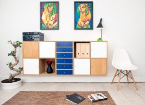
Throughout, a major theme is that interior design and architecture are idea-driven Fields participated in the making of experimental visions, not only the real reality of a brick bungalow or a tubular steel chair. That cerebral view will probably provoke a world-weary dismissal from individuals who’ve witnessed the costs, both financial and human, of designers’ failed visions. Think demolished public housing projects. But there’s no denying that the radical, often uplifting impact that design and architecture have made throughout the past 120 years.

The Show, to its credit, explores both sides of the coin.

Organized by Zoe Ryan, the museum’s chief architecture and design curator, “Past Forward” occupies the majority of the design and architecture galleries at the museum’s Renzo Piano-designed Modern Wing. (The remainder of these galleries will be dedicated to temporary museum showcases and displays).

As in the rest of the Modern Wing, the exhibited material — drawings, sculptures, pieces of furniture, posters, videos and much more — covers the period from 1900 to the present. It’s the first time, Ryan said, that the museum has collectively exhibited its holdings of modern and contemporary architecture and design. They amount an estimated 250,000 items.

However, this is a different type of permanent installation. A few of the show’s contents, particularly light-sensitive architectural drawings and fabrics, must only be exhibited for a few months at a time to prevent fading. So go now if you want see a drawing such as Ludwig Hilberseimer’s chillingly enchanting 1924 vision of a town whose residents reside at high-rises and work in factories right below.

The instalment — made by Julia Di Castri, who teaches at the University of Illinois in Chicago’s architecture school — neatly accommodates the demand for the exhibit’s ever-changing contents. In the deal, it underscores structure’s unique capability to frame space and provides visitors multiple paths throughout the show.

Diagonally organized, 12-foot-high walls produce a compelling tension with the odern Wing’s right-angled geometry and form a collection of room like spaces which contain the show’s thematic sections. Openings in the walls create alluring, down-the-alley perspectives that showcase prime display material, such as a multicoloured, stencilled wall covering by Chicago architect Louis Sullivan.

The best of the segments make fascinating connections among their subjects and the world at large. The one on offices, as an instance, demonstrates how the expansive, column-free insides of innovative structures such as Skidmore, Owings & Merrill’s 1955 Inland Steel Building in Chicago pushed designers to create lighter, more flexible office environments. Unfortunately, one such attempt flopped, resulting in the lucid wall text notes, to what we now know as the omnipresent and dull cubicle.

A more pleasing outcome can be seen from the aforementioned prefab kitchen and bathroom units, which French architect Charlotte Perriand designed in the 1970s for the Les Arcs ski resort in the French Alps. The fibreglass units were plugged into small apartments, holding down prices and helping to democratize a formerly exclusive leisure activity.

“Past Forward” also succeeds in pulling back the curtain on how architects change their theories into material reality; a process well illustrated by architect David Adjaye’s drawings and mock-up versions in the National Museum of African American History and Culture. And we see design’s importance in shaping a city’s image, evident in the artfully simple posters that the modernist graphic designer John Massey failed in 1966 to promote Lincoln Park and Lake Michigan.

Still, there are flaws, and they are partially rooted in the fact that curators are like card players — they need to play the hand they are dealt.

The Art Institute’s design and architecture holdings, as extensive as they are, aren’t all-encompassing, which leads to a frustrating gaps. The section on modern museum interior decorating, as an instance, has nothing to say about the powerfully sculpted, digitally enabled museums of Frank Gehry, whose Guggenheim Museum in Bilbao, Spain, dazzled the world and changed the course of museum design when it opened 20 years back.

Even if the collection is powerful, it’s not always well-handled. The show’s treatment of postmodernism is fragmented and unfocused. Stanley Tigerman’s iconic “Titanic” collage, which portrays Ludwig Mies van der Rohe’s Crown Hall sinking into Lake Michigan, appears in one section while some of the postmodern “Late Entries” into the Chicago Tribune Tower competition of 1922 are in another. Considering that the current resurgence of interest in postmodernism, the show’s inability to draw together these essential pieces is a disappointment.

Some of the design items on screen seem somewhat kooky, despite their provocative contemporary relevance. A seat, shaped like a cow’s chest, which reminds us of the animal origins of leather furniture? Such designs bring to mind Mies’ famous line: “I do not wish to be fascinating; I wish to be good.”

It’s much more moving to see among the moulded leg splints which California Designers Charles and Ray Eames developed for injured soldiers during World War II. The splint was a substantial step toward the sculptural moulded plywood furniture which the Eameses designed after the war. Architecture and design are at their best, this example indicates, when ideas are not imagined for their own sake but to enhance and elevate human expertise.